I’m deep in the trenches of wedding planning which—so far—has been an emotional roller coaster. For various reasons, we settled on what almost feels like a shotgun wedding—October 2025. Apparently, giving yourself less than a year to plan a wedding is unheard of by current American standards. Which is fine, I guess, because we’ve decided to get married in Italy.
So, an international wedding eight months (and counting) away, an unwieldy guest list, a non-existing catering plan, and the infamous color palette. What could possibly go wrong?
Let me start by saying, there are not many aspects of this wedding that I care too deeply about planning myself (famous last words), aside from my wedding wardrobe and invitations. Those two things are held fast in my over-controlling clutches.
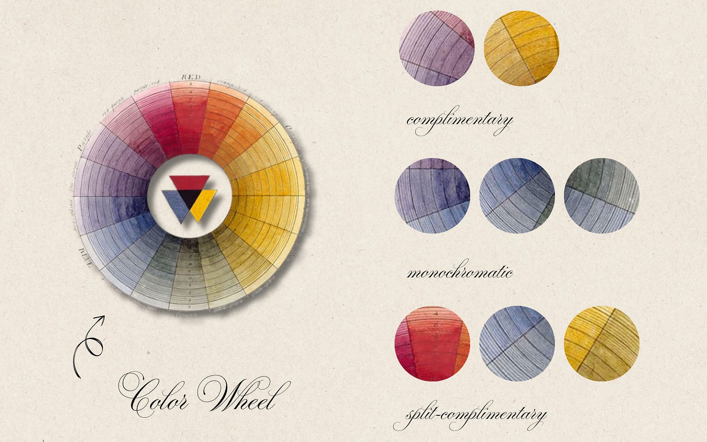
More on the wardrobe (and the rest of it) later, but the invitations are what launched the color palette debate to begin with. We were hustling to nail down a venue and send out Save The Dates (‘STDs’ as Erik and I like to call them), so I was willingly (?) coerced into sending out digital ones. That meant that I had to hustle on the color palette to ensure that the STDs would ultimately match my grand vision for the invitations. Make sense? Apparently not.

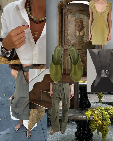
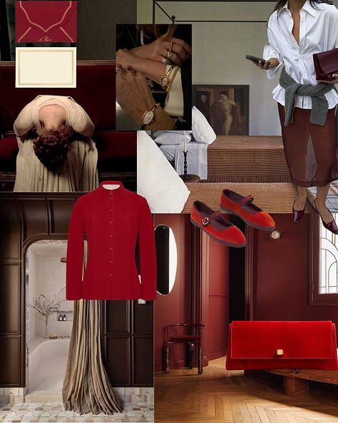
I got really crazy and did sort of a combination of all three types of color palette, which I’ll admit, may have been where my mom fell off the wagon. Burgundy, deep olive, muted chartreuse, light blue, and cream—or, three darker colors, two lighter ones. It sounds weird, but I think it’s money.
I live by color palettes in my line of work, so whipping one up to use for my wedding felt essential (and exciting). At the end of the day, color palettes aren’t binding—they’re simply a suggestion to help guide design decisions.
Anyways, if you’ve made it this far without falling asleep, congratulations and thank you. For that, I’ll throw you a bone that you didn’t ask for: my spring color predictions.
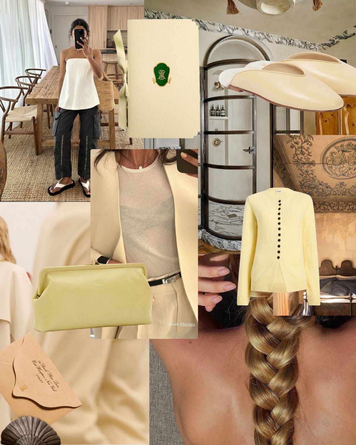
Enter: muted chartreuse, butter yellow, and cherry red.


If you spent any time at all watching the runways this year, you’ll have noticed that every fashion house from Totême to Schiaparelli was boldly claiming yellow and black as their new neutrals, with Khaite and my new favorite, Colleen Allen, bringing in a little extra spice with leopard, red, and chartruese (a winning combo, imo).
That’s it for now! Let me know if you make a color palette (and if anyone gets mad at you for it).
xx
Serena
Just want the visuals? Head to my Instagram.
Just want the links? Head to my ShopMy


Did a close to 300 person wedding in 6 months - you got this!
Love all these colour palettes, especially the butter yellow. x